Q: What do the different colors on the calendar represent?
A: Under the Stats tab, you will find your Food Logging Calendar. The calendar shows you how many days you logged as well as how your actual intake compared to your set daily calorie limit. The calendar is interactive, so you can use this calendar to quickly navigate between your daily logs - just click on a date to view that day's log.
The calendar is also color coded:
Grey - not logged
Green - logged and within set calorie limit
Red - logged and above set calorie limit
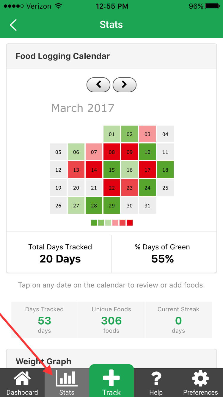
The shading reflects the proximity of your total calories to your daily calorie limit. The lighter the shade, the further away your net calories are from the calorie target. The darker the shade, the closer your net calories are to the calorie target.
For example, dark red would mean that your intake was significantly higher than your calorie target, whereas light red would indicate that you were just over the target.
The Stats tab also has additional logging stats and your weight graph, for a visual look at your progress as you work towards your health and fitness goals.
